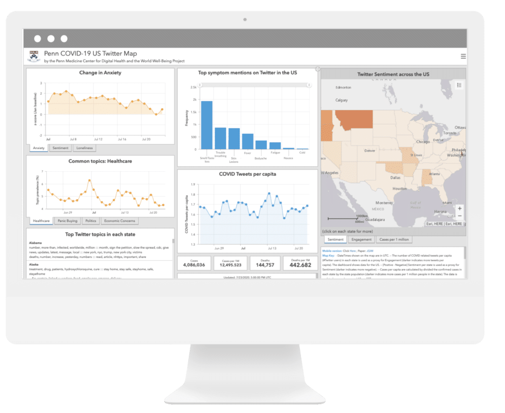
A dashboard that collects how Twitter users are feeling and what they’re tweeting about in real-time related to COVID-19.
Focused area: COVID, Mental health Platform: Web Product Duration: 3 weeks
My Role
The only designer in this project.
Led the design of Information Architecture and visual
Directly partnered with data scientist and psychologist to work on data visualization
Collaboratively built dashboard frontend
Directly report tothe lead of the department
Impact
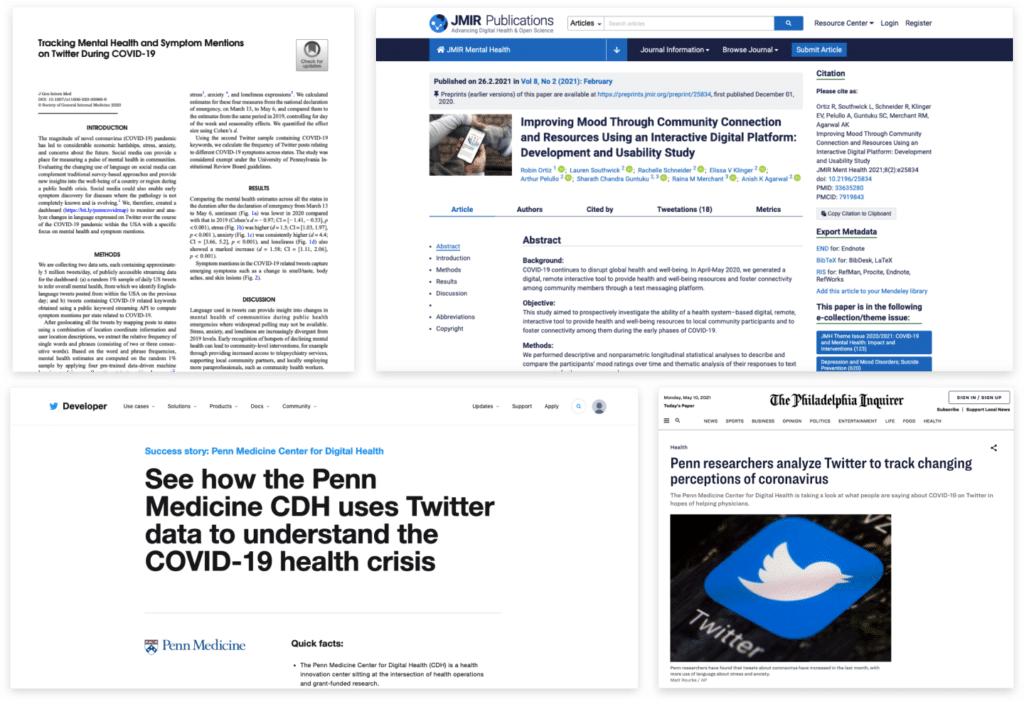
Since the dashboard launched, it received many admire and create social exposure,
I’ve also seen it helps with a lot of big data analysis publications,mental and behavioral scientific publications
Publications: Big data analytics, mental health Social Media Exposure: Twitter Developer, The Philadelphia Inquirer
Goal of the Project
The dashboard provides a holistic view of people’s mental health for health departments and systems and policymakers across the country to advance their efforts in real-time.
My Actions
Short project timeline
No capacity & resources for research
ArcGIS platform constraints
Topic and Data Selection
The decision on data type was made based on all team members and stakeholders’ decision
We decide to quantify people’s overall sentiment in their tweets through an algorithm.
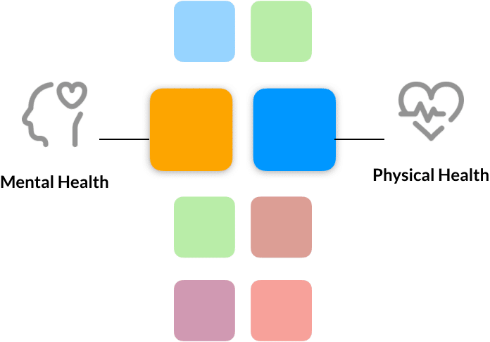
We can not talk about mental health without physical health, especially during the special pandemic time, we decided to also pull out COVID symptom keywords to see the frequency of this keyword mentioned related to sentiment score change.
Physical Health
Overall sentiment score changes overtime
Other topic keywords list (exploratory)
Interactive Map (optional)
Mental Health
COVID Symptom keywords
COVID Case
Interactive Map (optional)
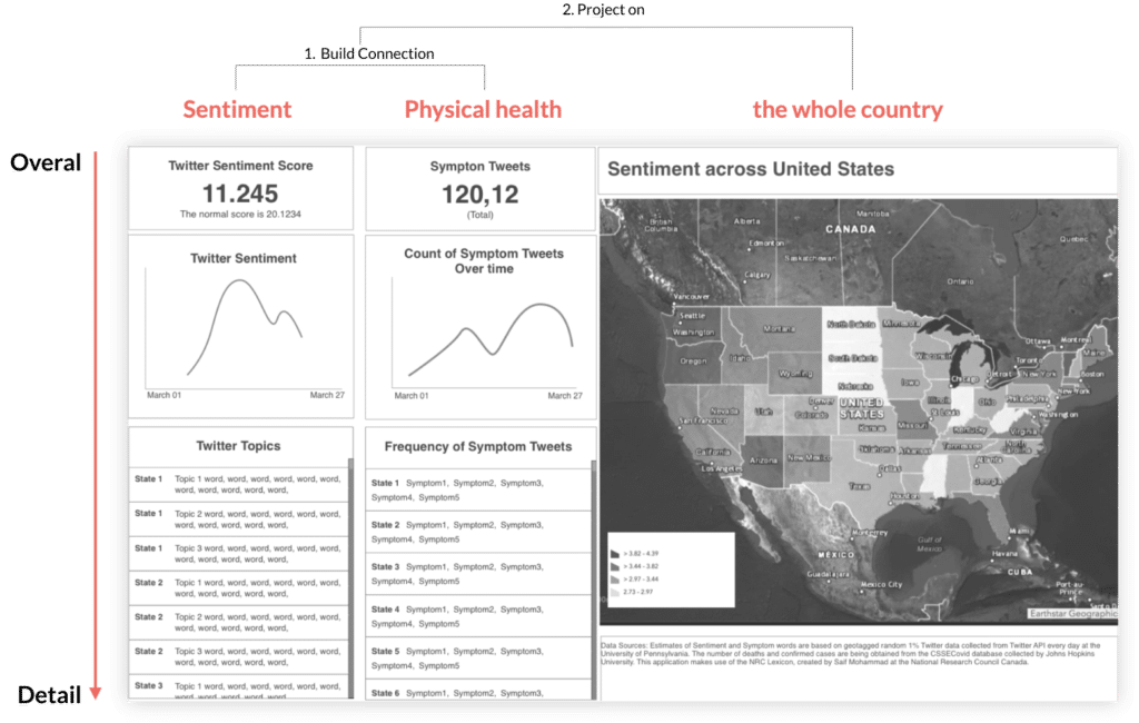
Low Fi Mockup
Option 1
Allowing users to build connections between different dataset
Information Architecture: Overview – Granular
Side-by-side Design: Tweets count and sentiment sitting next to each other makes users easily compare and connect
Interactive map
Left to right:
Start off with sentiment because our goal is to drive people’s attention to it
Having a physical health column side by side with a sentiment column allow the user to associate emotion with a pandemic, and to think about what causes emotional surge, how can it relate to the symptoms
Users can bring their insights to zoom out, from the small picture to the entire nation
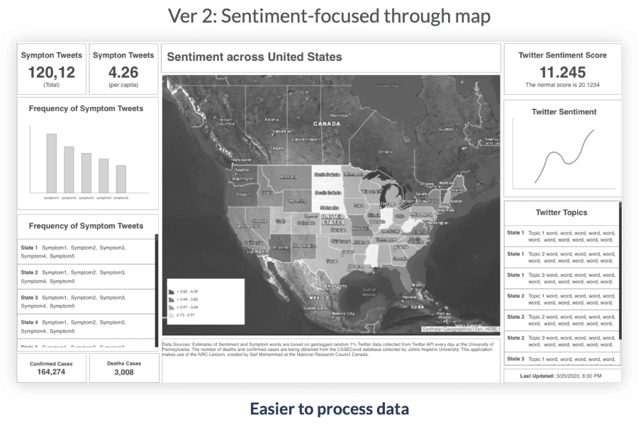
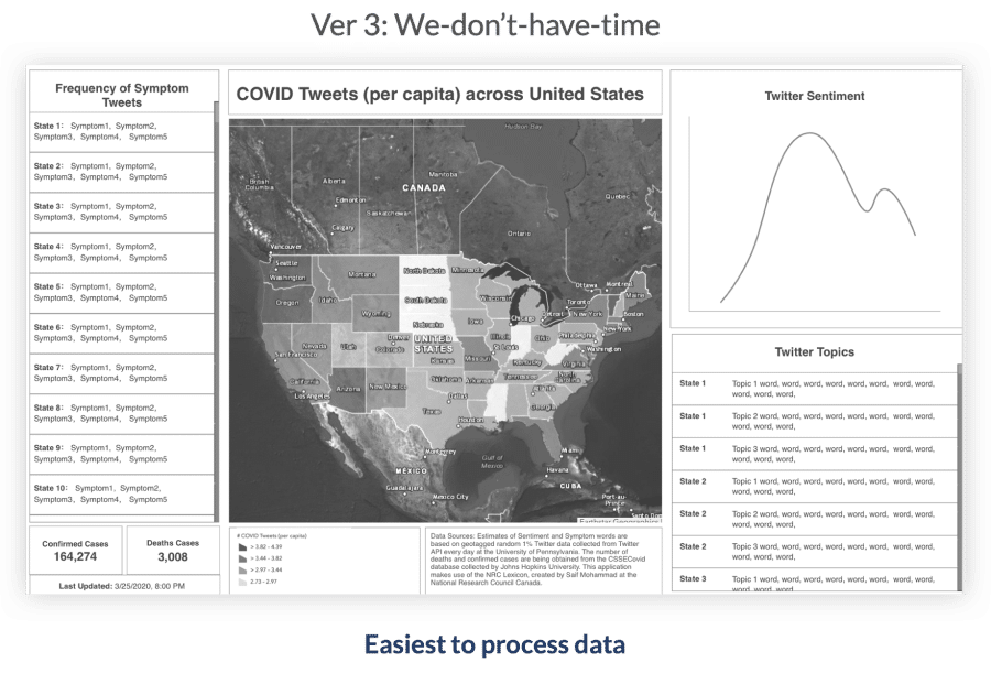
Other Ideas
I also created a version for the scenario where we ran out of time
I worked with a data scientist and came out with this version with a similar experience but required less time on data processing
Iteration
Because of the limit of time, I suggested it would be better to at least do a heuristic evaluation and comprehensive testing by gathering the whole team in a zoom meeting where I walk through the prototypes and the client provided direct feedback.
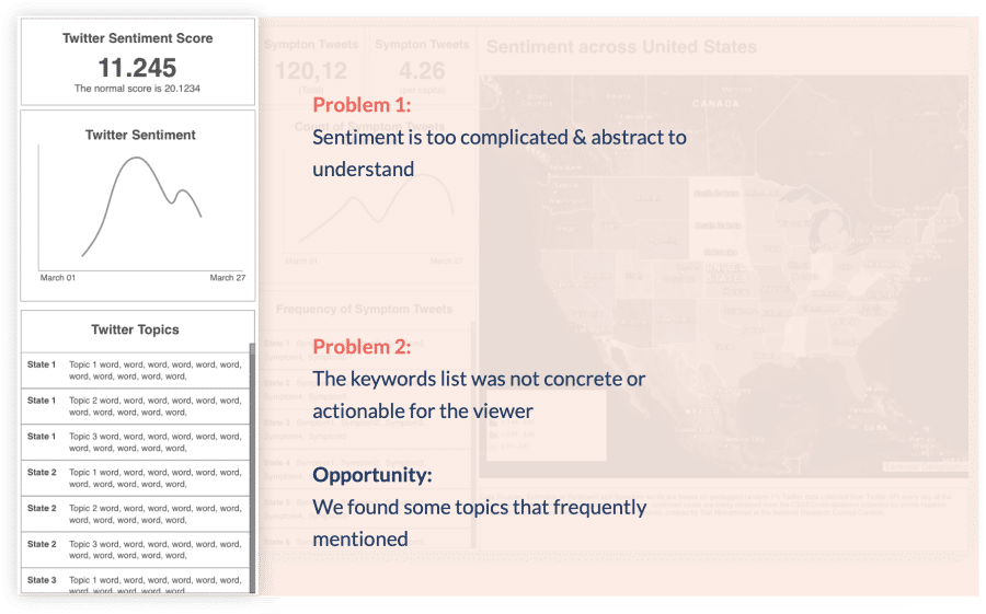
Problem
What Does “Sentiment Score” mean?
People confused about What this sentiment score actually means. It’s very abstract with a mixture of many emotions that can’t help with decision
Even if I have a list of keywords to help with users’ comprehension, in reality, after applying actual data, what it shows is just a bunch of Sentence Fragments, it’s too abstract and confusing for users to generate insights
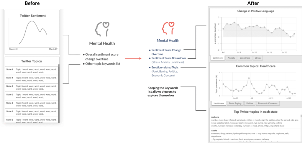
Improvement
Break down "Sentiment"
I collaborated with the project manager, psychologist, and data scientist to do the keyword selection. These keywords are based on psychological references provided by CDC and the data set we had on hand
We look at the Twitter library and select emotion-related words that turning prominent during the pandemic time such as panic buying, economic concerns, etc
We are looking at the frequency of these keywords changes over time
Sentiment Data & Information Architecture Changes
Sentiment Chart Changes
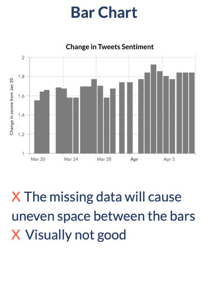
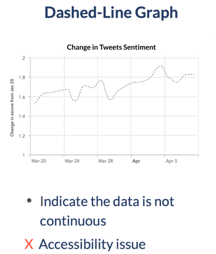
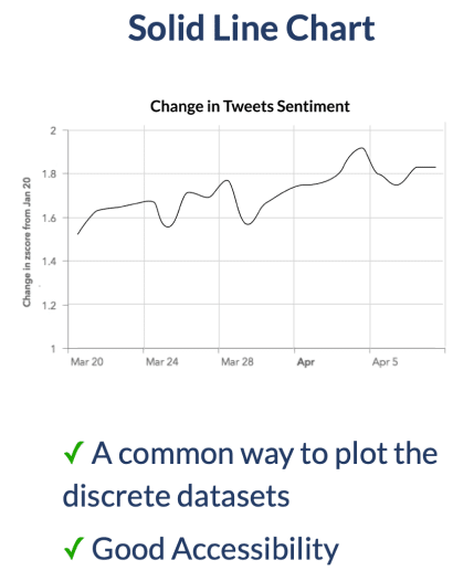
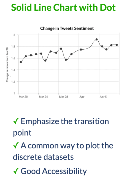
The biggest challenge for the data is that Lots of days’ data are missing, so which means they are not continuous.
I did a lot of data vis experiments to see whether I should show the discontinuity. I decided to move forward with the line chart. It is common that the discrete datasets are plotted as a connected line.
Filled Line v.s Non-Filled line
For the sentiment data, since ourmap wants to focus on people’s emotions, the filled area helps drive viewers’ attention.
Challenge - Color Selection
I’ve made a lot effort on choosing the right colors, there is many challenges such as ArcGIS developer has very limited color combinations.
Three Principles
Accessible in the ArcGIS onlinetool,
It should be easy for the viewer to distinguish two types of data that’sbeen presented on the dashboard at the same time (in this scenario sentiment and COVID tweets)
I also need to consider the accessibility
Color Blindness Simulator
The final decision was made by accessibility, I ran a color blindness simulator.
These colors can be easily distinguished by 9 types of color-blind people.