Partnered with UX research to conduct user testing
Other coworkers: Claim product owner, Claim dev team, UX writer, business team
Impact
To The Project
Successfully handed off, and ready to be implemented
To GEICO
Set an essential foundation for users’ studies of claim flow
Built confidence to improve in the department
Dealing with
car accident
is frustrated
Being involved in a car accident isn’t a delightful experience, even if you have been insured. You are still worried about how much it will cost and get your car fixed.
What’re Damage Inspection & Repairs?
1. Estimate
GEICO must be involved
Online estimate or drive-in estimate
GEICO staff evaluates your car damage
Draft damage report, price report
2. Repairs
GEICO's involvement is optional
Based on the damage report,and price report, the repair shop will purchase components
Fix the damaged part
3. Rental Car
Optional
If your car is not safe to drive, you may need a vehicle when waiting for the car to be fixed
Can be done by GEICO affiliated shops
(All-in-One Service)
Information From the Product Owner
Project Goal
An optimized flow that helps customers schedule estimates and/or repairs to increase the completion rate.
System Issue
GEICO has 4 separate flows for customers with different service eligibility which lower the efficiency of claim management.
Business Requirements
Increase the utilization of All-in-One service and drive customer traffic from drive-in appointments to online estimates,.
Understand Users
I wasn’tjumping into design, I wanted to learn what was going on in the current flow. I asked UX research about some of the research about scheduling flow. I also asked the product owner if she was aware of the research and whether they’ve generated some ideas.
My Actions
Discussed with UX researchers their previous unmoderated studies’ results
Read competitive analysis studies report
Watched 2.6 hrs Quantum Metrics recording
Heuristic Analysis
Problem of Current Design
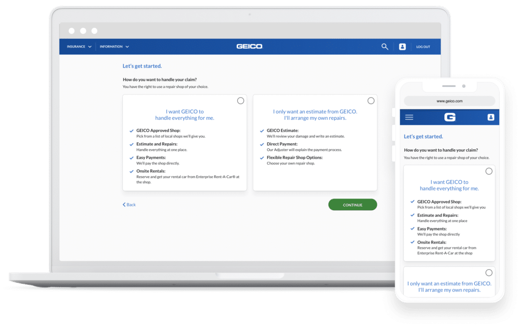
Problem 1
4 Separate Flows Cause Inconsistency
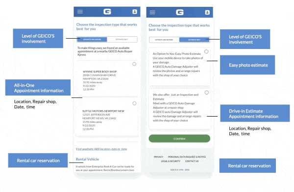
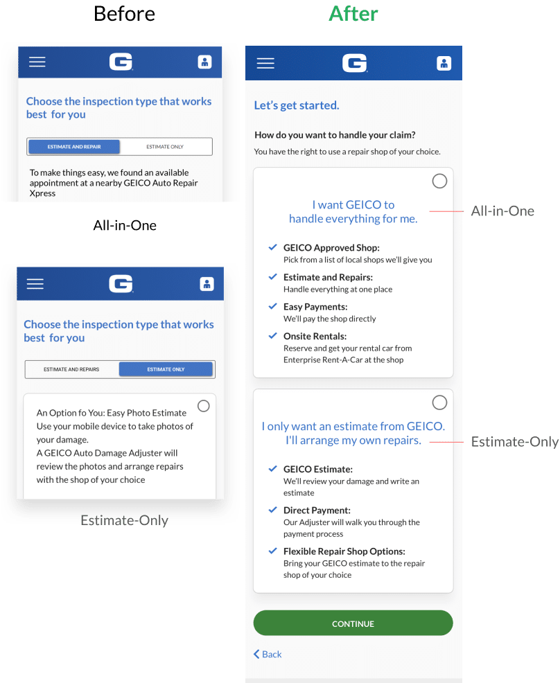
As I mentioned in the previous section. GEICO has 4 different flows for users with different eligibility. One of the examples shown in the picture “Flow Issue 1” and “Flow Issue 2”. “Flow Issue 1” is a full access service v.s “Flow Issue 2” is in a testing environment, and the Rental service is not available for the user who wants only an estimate.
The visual is inconsistent and so does the experience which will potentially cause confusion.
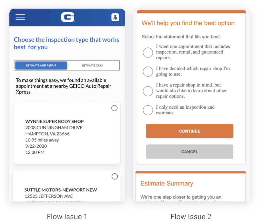
Problem 2
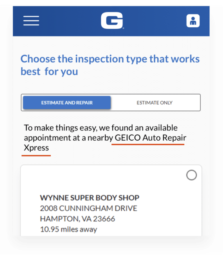
Too many Decision Points on ONE Page
This is the flow that 80% of users are using. GEICO is trying to have everything on one page in order to speed upthe process, but the amount of information overwhelms users.
Problem 4
Options Are Lack of Information
When offering two options. There is no useful information displayed for each option, users can’t tell what the difference is.
Problem 3
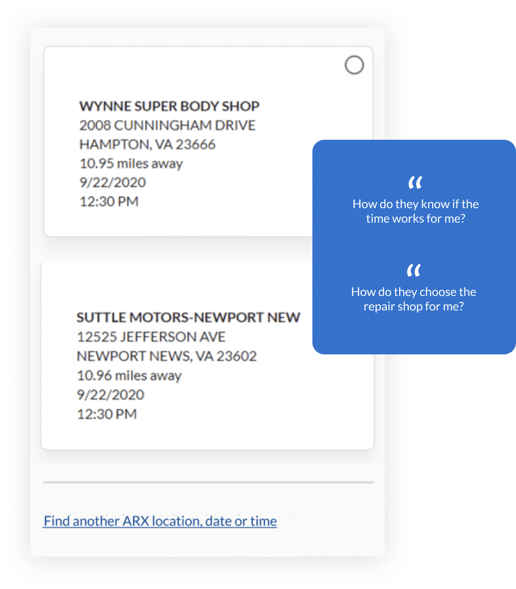
Confusing Feature "Assumptive Offer"
The feature Assumptive Appointment can generate the earliest appointment at the shop that is closest to users. They assume that it helps the user make a -one-click appointment.
However, it brings more questions, users got really confused about “how do you know if I’m available at that?”
Problem 5
Confusing Jargon
There are many unclear jargon inflows. ARX is the term for GEICO affiliated center where they handle all-in-one service. Unfortunately, users didn’t know what itis and assumed that the car will be fixed quickly without quality.
It’s hard for customers to make a variety of choices throughout the experience
“When people CAN’T decide,
they DON’T decide.”
Direction
Reduce the decision points on one page
Explore alternative UI components that are better suited for comparing/contrasting options and decision-making
Improve terminology and definitions for better user comprehension
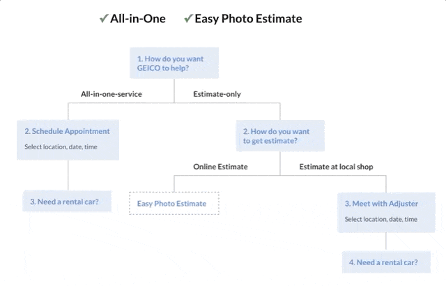
Design User flow
Reconstruct Flow
I broke down the decision points and reorganized and reconstructed them to a new user flow.
By doing that, it minimizes the number of information presented to users at once and, the flow walks through one question by another which dramatically reduces users’ mental load.
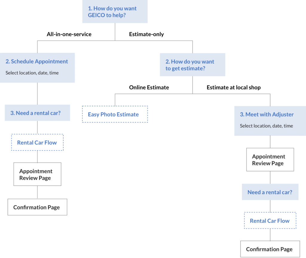
Solving 4-separate-flows Issue
A single scheduling flow that allows for skipping the function if customers don’t have the eligibility. When I designed the flows, I wanted to ensure the scalability of our system.
I tried to keep different features and functions independent ofeach other and let the flow bridge them.
Final Flow
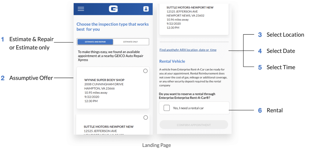
Confirming the placement of rental, review page, and confirmation page. There are two points that I will talk about how I iterated later on this page:
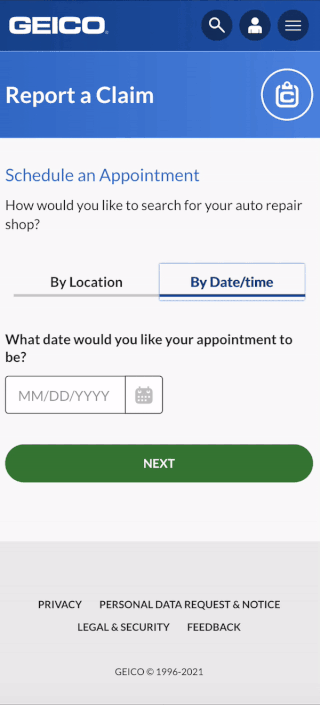
We have two scheduling types – “Search by location” and “Search by date”
Rental placement in the Drive-in (right side) flow is different from “All-in-One Service”
User Interface
Options with Clear benefits and Digestible information
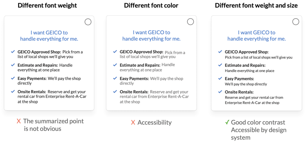
I list out and clarify the benefits and differences for each option in this checkmarks format
With short bold summarized points, it makes information more digestible
Humanized Language
I also worked with a UX writer to simplify the language and remove the jargon tomakeit more understandable
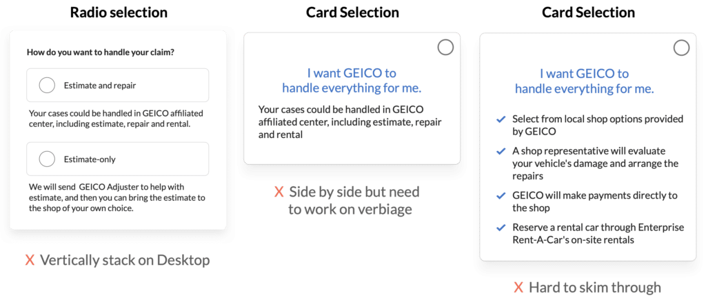
Selection Card Iteration
During testing, I learned that many users are likely to skim through the content, so they are easily missing and forget information.
I worked with a UX writer many rounds to ensure the content is informative but easy to skim at the same time
UX and Verbiage Iteration
Summarized Point Visual Iterations
"By Date Flow" Iteration
What's "By Date Flow"?
For “All-in-One” users, they need to search a GEICO Affiliated Center to get an estimate and repair. For “Estimate Only” users, also need to find a repair shop to meet with their Adjuster to get the Estimate done.
On both flows, users need to find a shop to schedule an appointment. GEICO provides two search type, “By Location” & “By Date”.
When I started the design, there were already two flow types stored in GEICO’s design, so I use our design system as a starting point.
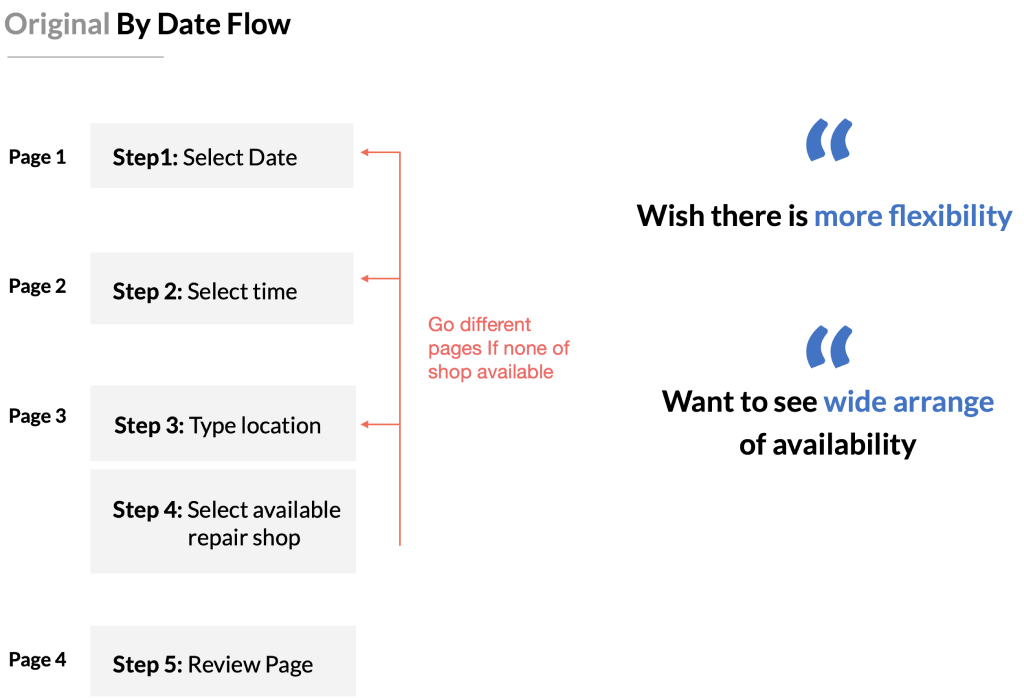
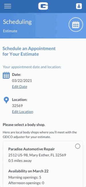
By Date Flow: Select date – Select time – Select location for shop – Select Available Shop – Review Appointment
My consideration: Is By Date Necessary?
I was curious since GEICO has implemented by location in production, why would we want to have an additional search by date? However, we couldn’t find any research on that. So I suggested we should have moderated testing on it.
There are a few questions I want to get the answer to:
how does “by date” help the customers during the flow
What users would like to use them, and why. What’re the problems with the by date flow etc
4/7
Users find By Date Flow it’s useful
“I’m a full-time student, I will choose by date because my calendar is usually full,
I need to look at different time slots to match my availability”
Improvement Opportunity
The by date flow is narrowing down the shops step by step on 3 pages.
If users find that none of the shops is available at that time on that specific date. They have to go all the way back to the beginning.
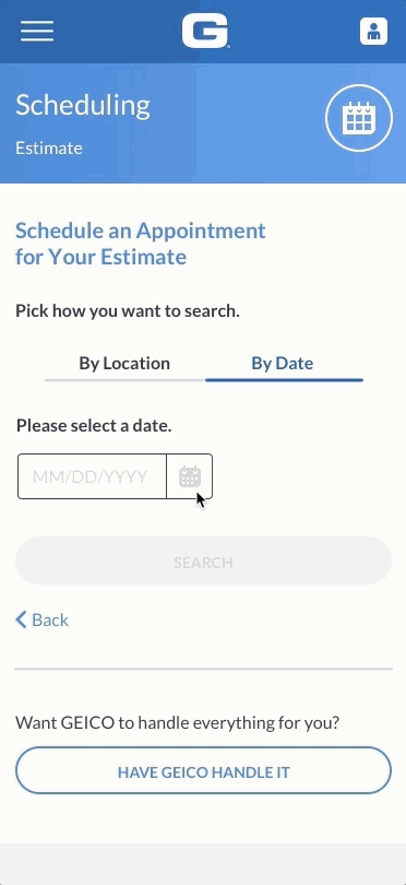
New By Date Flow
Step 1: Select time and confirm the prefilled location
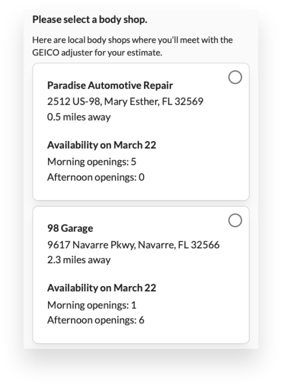
Step 2: Selected a shop (provide an overview of each shop’s availability).
Step 3: The available time picker will show at the bottom. Users can easily switch and check each shop’s availability