Other coworkers: Senior UX designer, design lead, dev lead, UI developer
Impact
Improved GEICO grid system improvement
Optimized time tile selection component
Initiated background image component
Improving filer component
"He (my dev lead) is just a giant teddy bear"
My manager tried to cheer me up when I failed at proposing changes to a component.
What actually I was thinking of Teddy bear. Shhhhh...don't tell him.
Improving design system is hard, especially we already have a pretty solid design system.
I think this is a common struggling. It’s always easy to figure out a series of design specs (dimension, color, how our users interact with it)As a designer, we can easily sense (or we are sensitive to) what component could be visually improved, but to other stakeholders (especially dev team), changing a style or interaction is to bring A LOT OF coding works. Tweaking html/css is exhausting.
When proposing, let's think about WHY NOT the old design
I use the following framework to ask myself when I want to change any component. Helps me avoid self-referential design.
Is it user-centered?
How the old component brings bad experience
Where and when users are struggling with the old design?
Why are they struggling?
Is there any other alternates to improve users experience without change kit?
Does it improve the internal efficiency?
How does new components improve the corporate/team collaboration efficiency
Do the teams use the component?
Even if use. It often comes from the cases where design team/dev/project team need to manually change the existing component (not directly using it) in order to accomplish task.
Does it match industrial trend/guideline?
Is it visually good? Does it meet WCAG AA?
No one (I mean users and company) wants to use an outdated design system. A modern/good looking can improve a company brand profile but also increase product usability.
NOTES
Usually I don’t need all of three principles to make proposals. User center is the strongest evidence to make a proposal. When going through testing, I like pay attention to users behavior at component level, collecting those small unhappy moments and share it with your team , you may be surprised by how common the problem is.
If there are no user data, I would use the combination of the second and the third principle. I would also share the findings in the team to see if other design teams have same component needs.
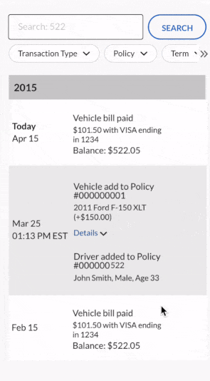
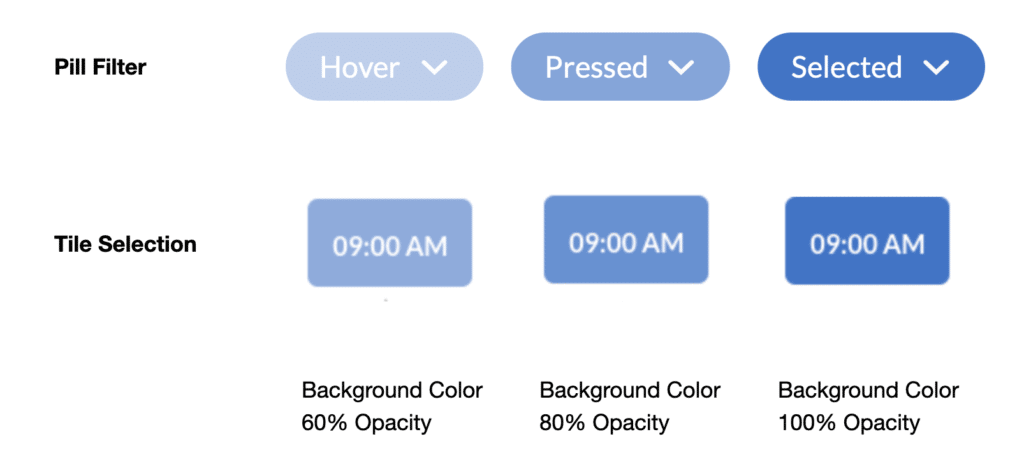
Pill Filter
Compact components that enable users to make selections, filter content, or trigger action.
Why the old design need to be improved
Starting off from user experience.
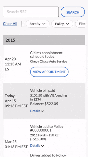
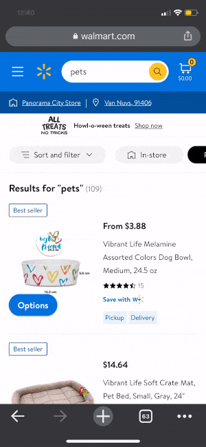
It’s not as accessible on the mobile as it’s on the desktop. It layout all the filter options on the desktop version, but on mobile, the user need to click to expand to see the filter options.
This layout works only when we have a very limited number of options, but it causes scrollaphobia when it gets too long
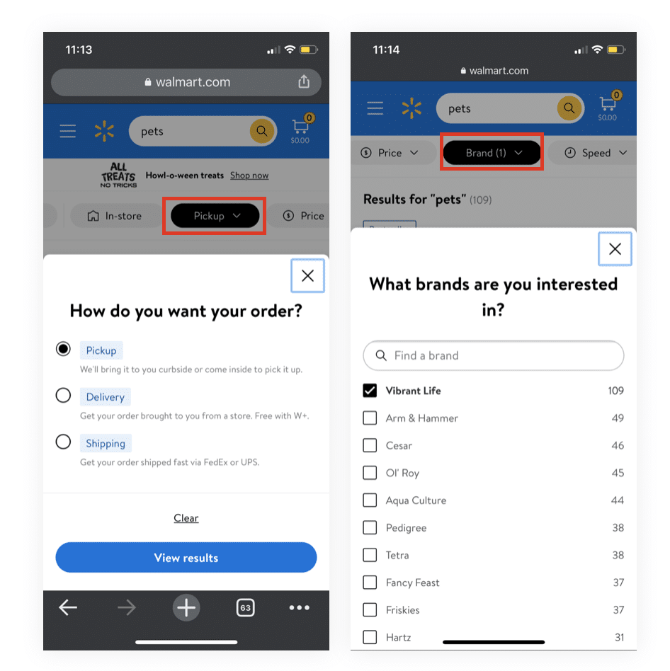
Customer might not be able to tell whether they successfully apply it since there is an indicator
People can’t even tell if the filter has been applied.
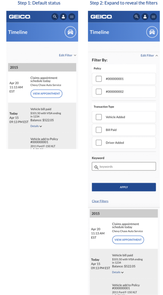
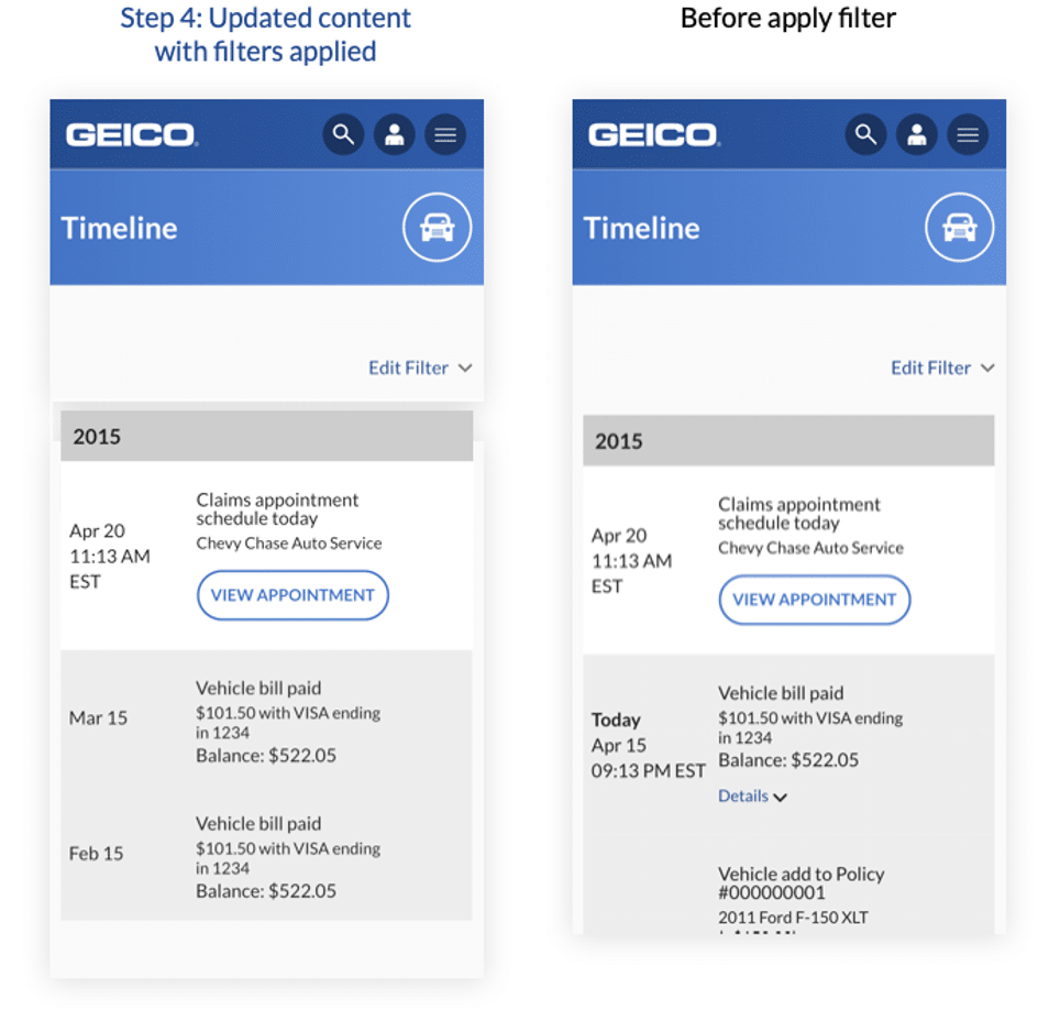
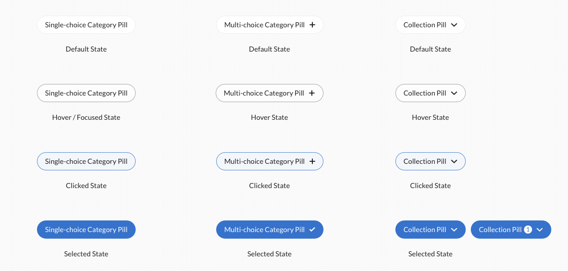
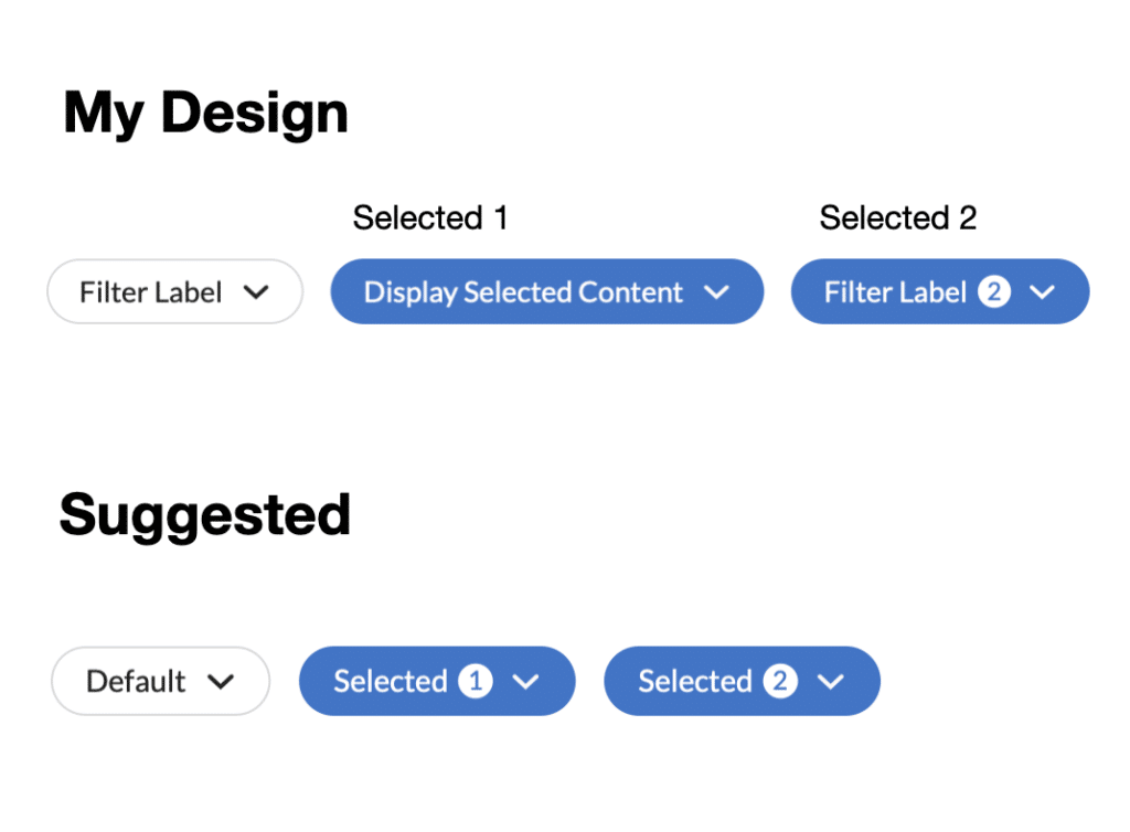
Solution (1/2) - 3 Types Of Pill Filter
Solution (2/2) - 2 Types Of Placement
Collection Pill
Overview
Colletion pill is one of pill type which could contains multiple options.
When you click on the pill, that reveals additional filter choices displayed on modals
in the modal you can put radio selection or multiple selection components in it.
User-centered Design Rationale
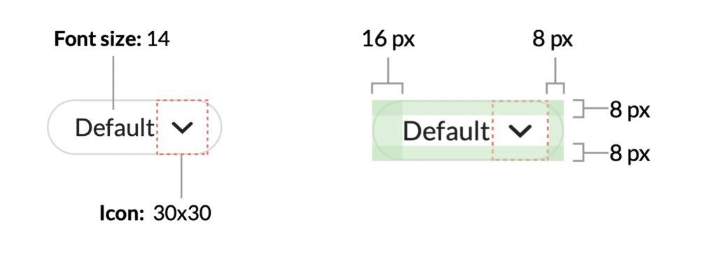
The dimension is a reference to the material design chip’s design to make sure that people can comfortably tap on it.
Accessibility: The good text-background contrast ensure good accessibility which meet WCAG lv AAA
Save dev's team efforst
I want to save as many dev team’s effort as possible. It’s also chance to earn trust when presenting to dev lead
I reuse status changes from some of existing component
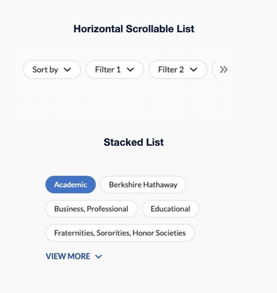
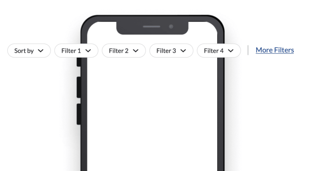
Placement - Horizontal Scrollable Section
Overview
The design was decided by the design team’s requirements and users habits
In many use cases at GEICO, the filter isn’t the primary content on the page. Such as e-commerce for sales, a select auto repair shop in claim flow. In order to not push down the other more important content like that. I decide to use a one-row scrollable section
It also ensures the filter to be exposed to users, which make the filter accessible and handy
This solution is also scalable, if the project team wants to have more than 5 filters available, we can easily group the other filters in the More filter.
Feedback & Concern
Concern 1
Dev lead wants the indicator always to show instead of showing the content to save dev efforts
Concern 2
Will people forget that they’ve selected filters?
Concern 2
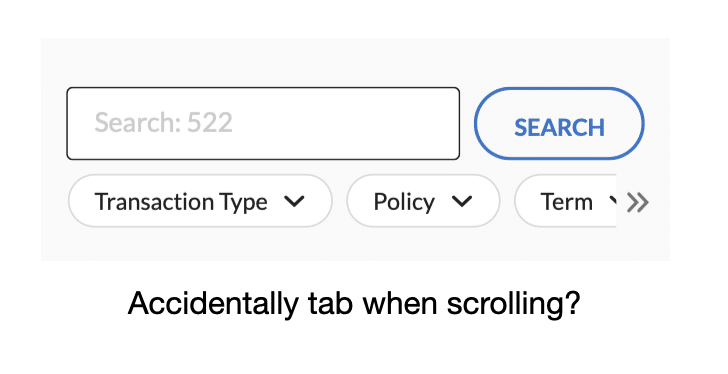
Dev lead: Scrolling + tap might not be a good experience for users.
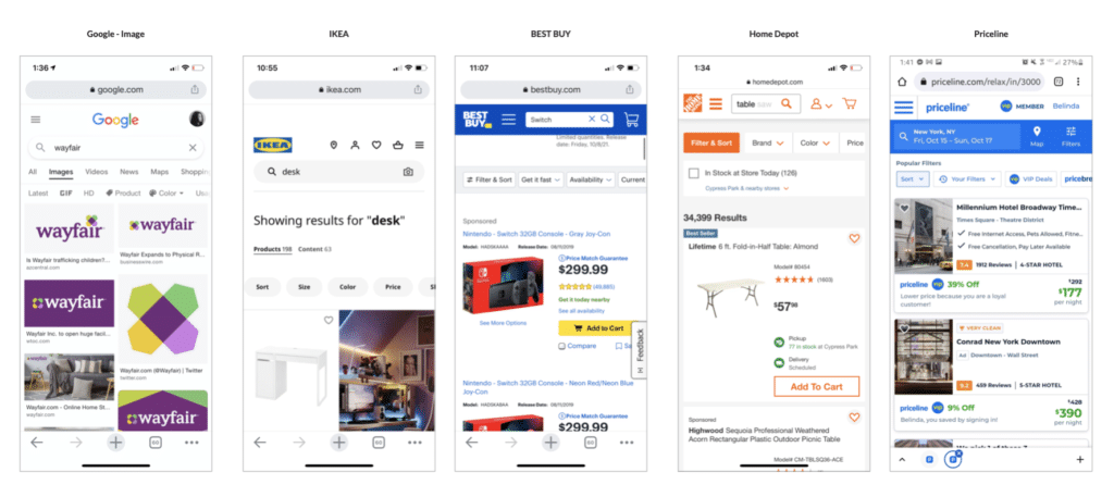
Testing
The best testing way is to test on an actual,third party website where they are using a similar scrollable filter design, instead of making a fake prototype
I looked at 10+ web product that has the scrollable filter
Testing objects selection.
I narrowed down to three products
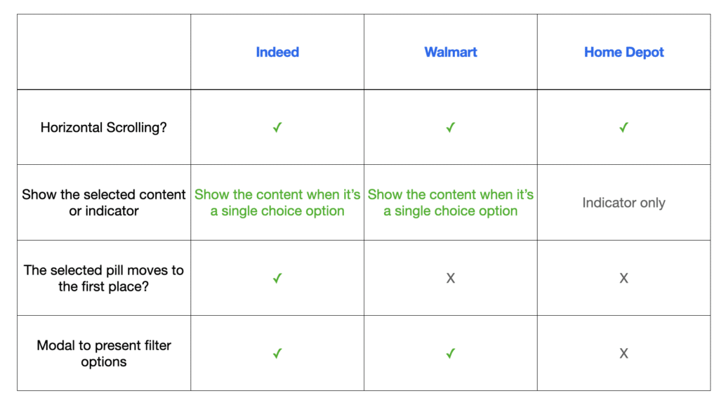
Indeed, Walmart, and Homedepot
Because they are close enough to my design, but also has good variations to help us decide some specific design
For example, if we compare Indeed and Walmart, we can see how ppl thought about the “Swapping the selected pill” interaction
By comparing the result of Walmart and Homedepot, we can see how ppl feel about displaying indicators only
Result
No concern and difficulty do combined interaction of tab + scrolling
No difficulty to find the selected filters.
People have no preference to only see indicator when it’s a multiple choice filter.
They did feel more logical to see the content if it’s a single choice, so I made following design decisions:
Indicator (Multiple choice): no preference
Indicator (Single choice): showing the content makes more sense than just numerical indicator
Dev lead: Scrolling + tap might not be a good experience for users.
Impact
Filter component is currently used in
1. Get a Quote Flow 2. Timeline Page 3. GEICO Design System Page
