As a product manager: Directly worked with Bold Solution’s founder to build project scope and roadmap.
As a UX designer: Led the design of information architecture, storytelling
As an Art Director: Led the visual exploration, branding
As a UX writer: Partnered with the Team lead and director to generate content for the website
Impact
To The Project
Successfully handed off, and implemented
To Penn Medicine
The team has increased its social exposure
Challenge
Lack of Content
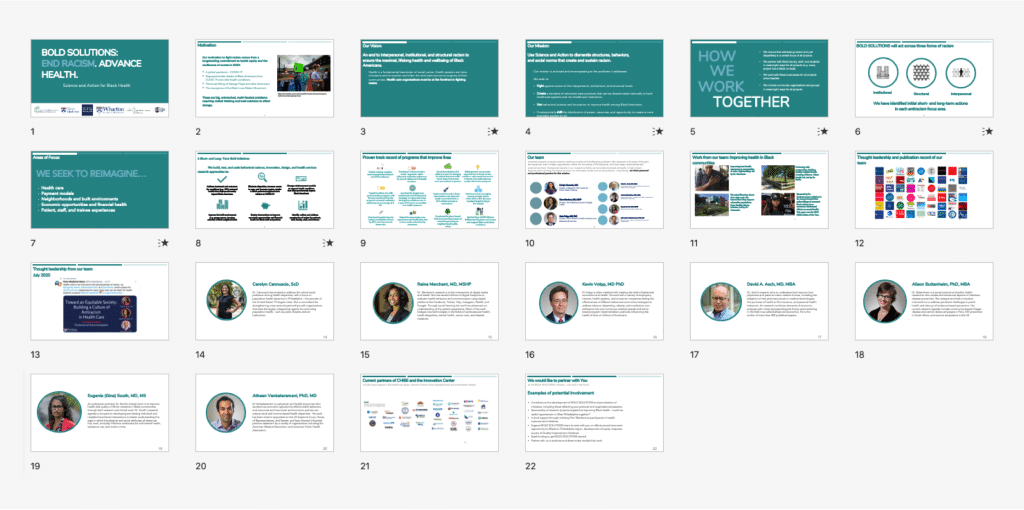
1. As you already see, the first challenge is Lack of content – All I got is just a slide without content/story for the website
No Branding
They don’t have any solid branding – they are using a general Penn Medicine slides template that lack of their own design language
Tight deadline with relative large amount of works
Given the 3-week timeline they asked for, I need to finish website design, branding, copywriting, provided associated exploration, and got this thing all approved within tight ddl.
This is all the material they gave me during the project. This is a slide deck that they use for pitching ideas to their potential client.
The first thing to do is
NOT design.
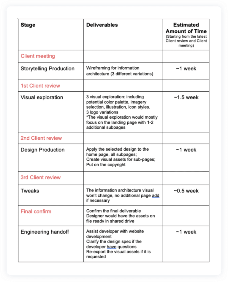
Step 1 - Road map
After getting a basic understanding of what they expect. The first thing I decide not to do is design
I remotely worked with their director team to clarify project scope and timeline
Created a reasonable timeline
Planned the project scope
Quantify design outcome
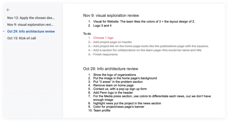
Step 2 - Set Up Weekly Check-In
As a project manager. I set weekly check-in reviews to keep the team updated and receiving feedback so I can adjust the design or timeline
I documented notes for each review session, includes key discussion point, and to-do list for myself and the other stakeholders
Design Prep
How I Approached The Project
I specifically ask
who is the audience
What action item you want from the audience
What ’s goal of the website
These information helps me make decision on information hierarchy, CTA, copy writing etc
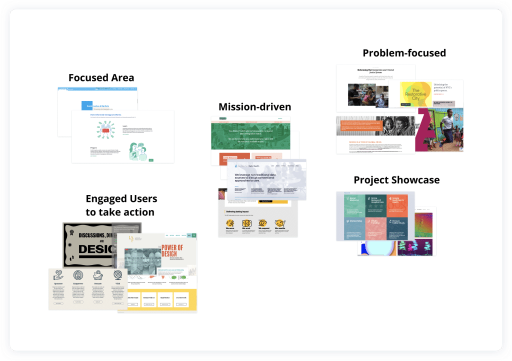
Looked For Inspiration - Mood Board
After I looked 20+ non-profit website, healthcare, diversity, startup. I found that the visual varies depending on what story they want to tell
So I grouping the reference based on the information architecture
I also write down what’s great about the website and what might catch audience attention
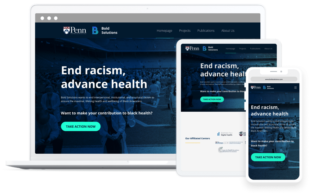
Design - Information Architecture
Variations
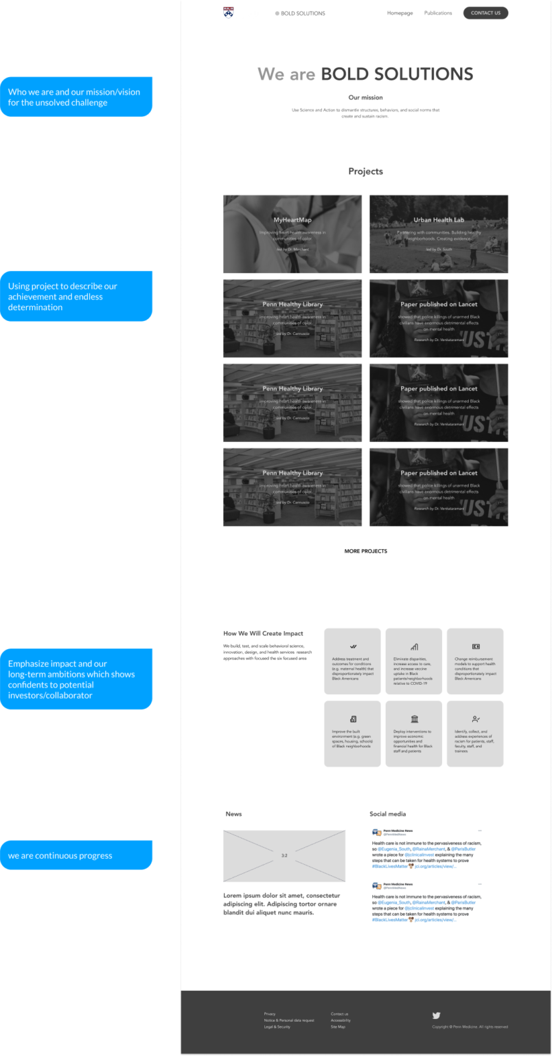
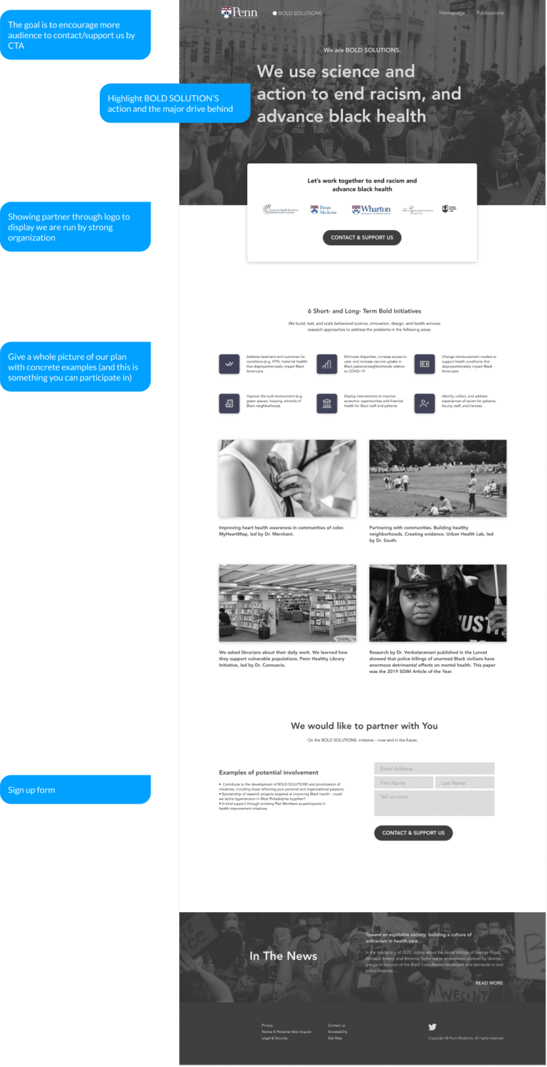
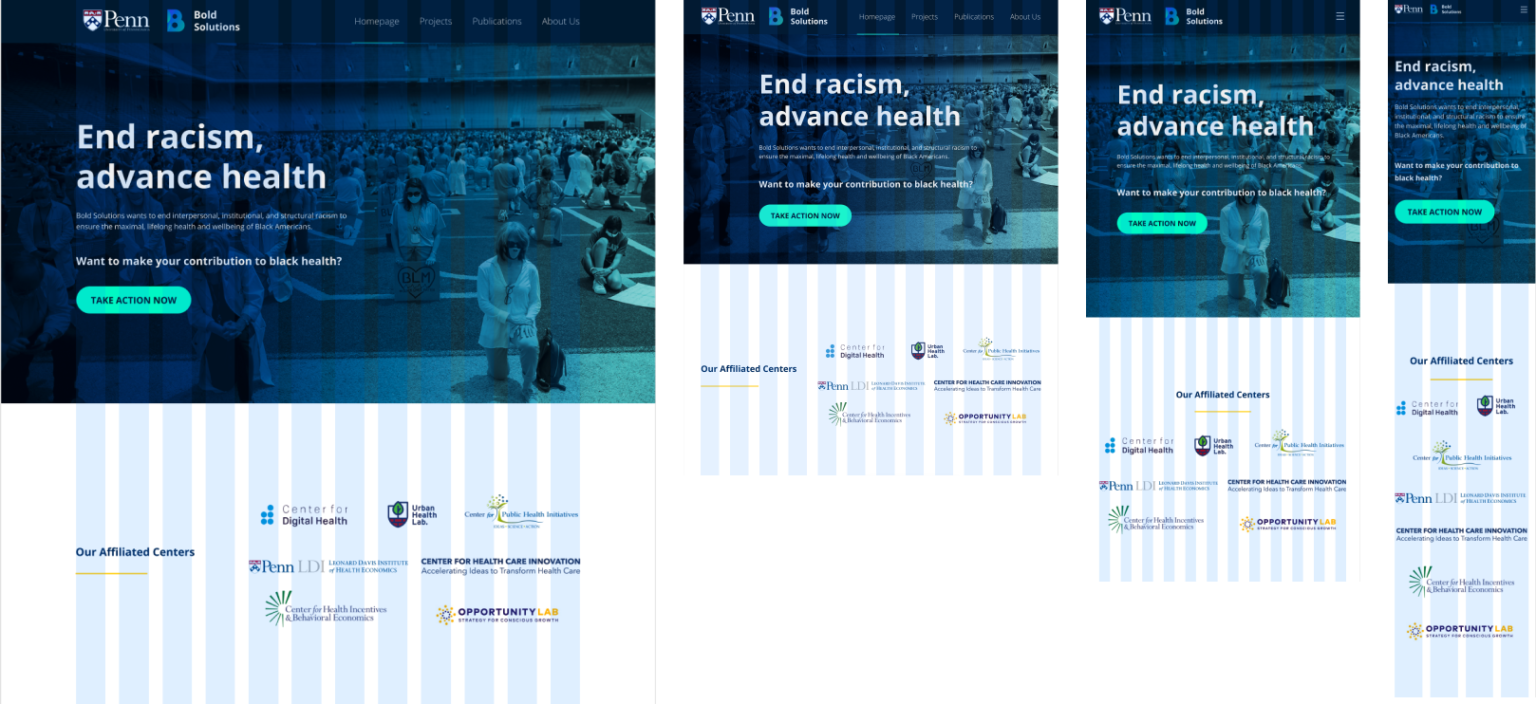
The first part is homepage where the major iterations happened.
I provided three different variations. Use the first one – project-focused as an example:
1. We first show what’s mission is
2. And then followed by project section, using the project to echo the mission, this will dominate the page
3. Then dive deep into it to display the impact and long-term ambition
4. And build confident among our potential investors
5. Below is a news section that has the potential to demonstrate credibility and effectiveness.
Project-focused
Problem-driven
Action-centered
Design feedback doc that everyone can access.
Have an organized design review doc brings everyone on the same page. I also include a “to-do list” section for every stakeholders, so that they can better support my design work within the limited timeline.
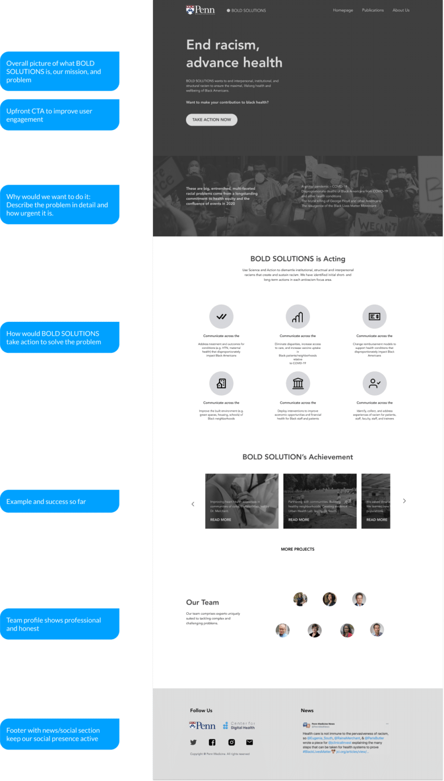
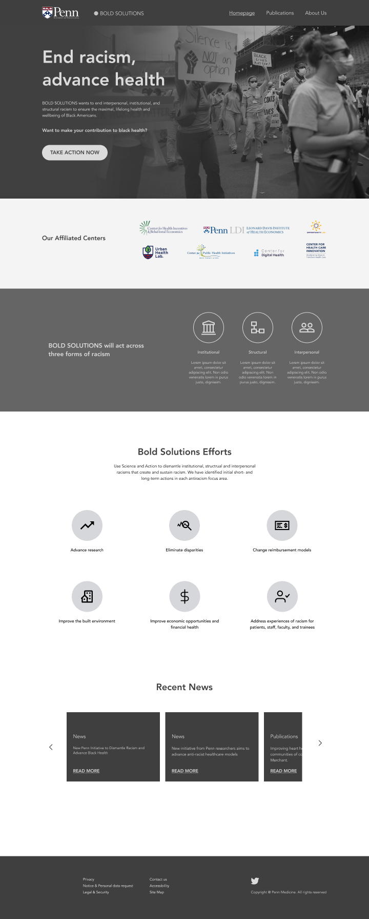
Final Information Architecture
The final IA was different from any of the design variations I showed above, because the team doesn’t have many projects to show. So I switch my focus to “how the mission statement guide the team move forward” and “Showing credibility”.
For example:
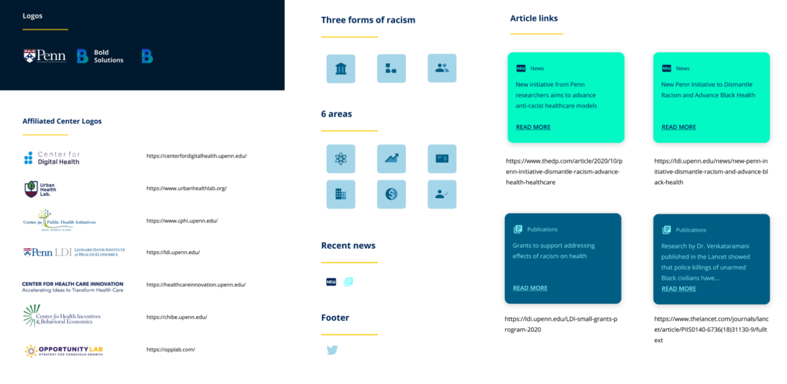
showing the affiliated partners showing credibility to the audience.
Introduce the three types of racism that existing in healthcare area that the team is going to make all the effort to solve, and then followed by a section showing how bold solutions is going to solve the problem. the 6 focused areas are the main directions they are going to work on
Design - Visual Guide
Sometimes clients have a hard time verbalizing the design in their minds, but we can guide them.
Building a branding system is very similar to build a product, we need to take users-my client into consideration
I asked two question
What information/feelings you want to express through the Bold Solution Project?
what is your expectations on the visual part?
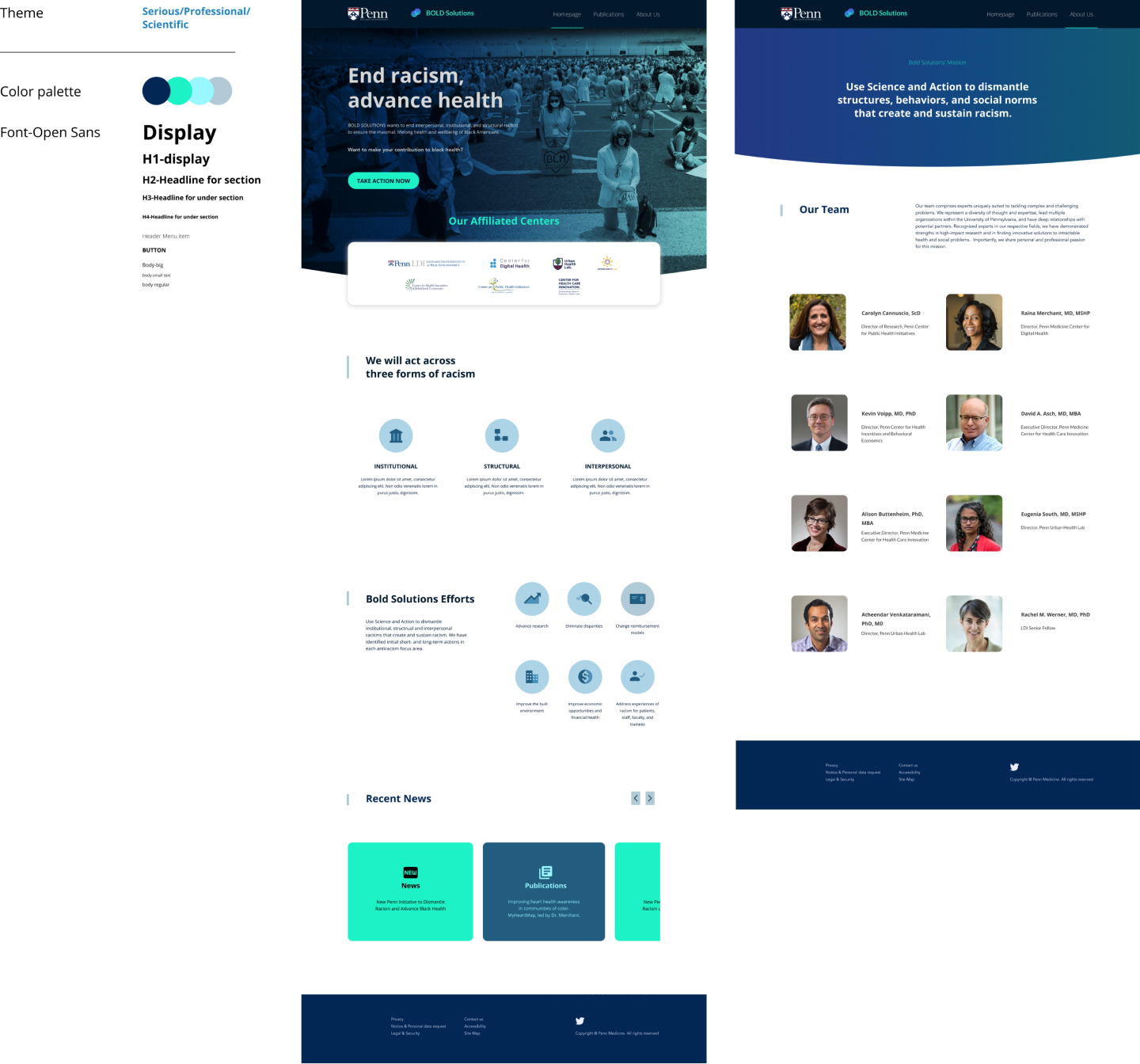
"Clean, crisply designed, professional, Penn based, consistent theme across pages, serious and scholarly tone."
These keywords help me get a sense of what the team is actually want and it guided me along the design process
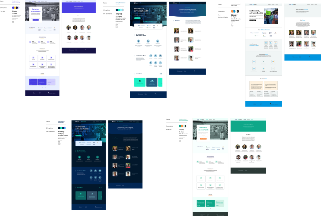
I used these keywords as a guideline to find inspiration, which works really well and efficiently, and here are 5 directions I ended up showing to my client
Final
Each visual proposal come with the keywords that I reference to, color palette (primary/secondary/variants), font type, and font scalability. Once the design selected, it’s easy to apply the visual to the mockup.
Grid System
I use grid system to make the design responsive in different devices. It’s also a critical guideline to ease dev team’s work.
Handoff
It was my first time to work with their team’s developers
To ensure the smooth handoff process, what I did first is. to have a meeting with their dev team lead, to ask about what are the handoff tool they are most comfortable with. After they are good with Figma, I created the documents with exportable design assets and design spec for them
During the process, there are a few back and forth between me and dev team, for example, some of design might increase the cost, I need to adjust my. Design to make sure they are within the budget.